The product is better than the packaging
There is a carefully made product, produced on a small scale, inside packaging that does not set it apart from anything. On the shelf, whoever gets seen wins.
In food and hospitality, the buying decision is quick and almost always visual. Packaging decides on the shelf, the photograph decides on a home delivery, and the window decides on the street. At the same time, it is a sector with labelling and consumer-information rules that leave no room for improvising, where the same brand has to work on a jar, an apron, a menu and a phone screen.
That is why we almost always work on the brand and the material it sits on at the same time. There is no point designing a beautiful label without knowing what information it is legally required to carry, nor building an online shop without understanding how the product gets packed and shipped.
The most common reasons people come to us.
There is a carefully made product, produced on a small scale, inside packaging that does not set it apart from anything. On the shelf, whoever gets seen wins.
One version on paper, another on the website, another on the delivery app, each with different prices. It is the costliest mistake, and the easiest to avoid.
Images taken in a hurry, under ceiling light, sitting next to stock photos. In a sector where people eat with their eyes first, this takes away more than it adds.
Fresh produce, costly shipping, use-by dates and insulated packaging put a lot of people off before they even try. Not every product sells online the same way.
It works well on the shopfront and disappears everywhere else: on the takeaway packaging, the bag, the napkin, the social media profile.
From a neighbourhood restaurant to a producer with distribution, the scope changes, but the work involved tends to repeat.
Identity and visual system designed from the start to fit on a label, a bag and a box, with room set aside for the information that has to be there by law.
A website where the menu is changed in one place, and where the dishes, allergens and opening hours stay readable on a phone, which is where people actually check them.
With the rules the product demands: minimum quantities, delivery zones, lead times and packaging. That was the case with Feitoria do Cacao.
Printed menus, window display, vinyl graphics, interior signage and takeaway packaging, all in the same visual language.
Social media and campaigns tied to what is happening at the restaurant: seasonal dishes, new arrivals, collaborations, appearances at fairs and markets.
Each page explains the process, the deliverables and the most common questions.
Feitoria do Cacao is a chocolate producer for whom we built the website with an online shop, alongside the stationery and the vinyl graphics applied in the space, with a handcrafted-feeling interface built around the product. Raiz – O vegetariano do bairro brought together brand, menus and website. Gelato e Limonata and Noeirinha, with its salt production, complete the group. See the portfolio.
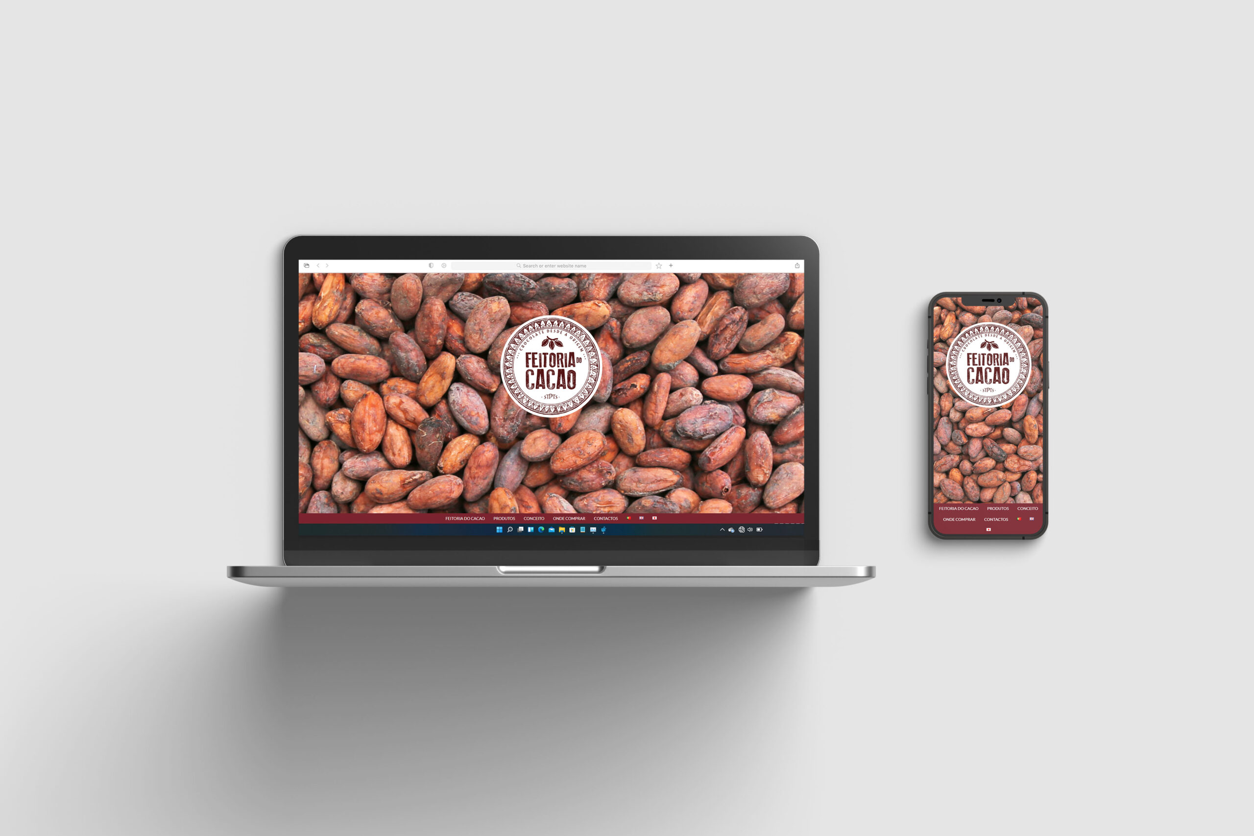
Feitoria do Cacao
Noeirinha
Gelato e Limonata
nomenu.digital
Quinta Do Escudial
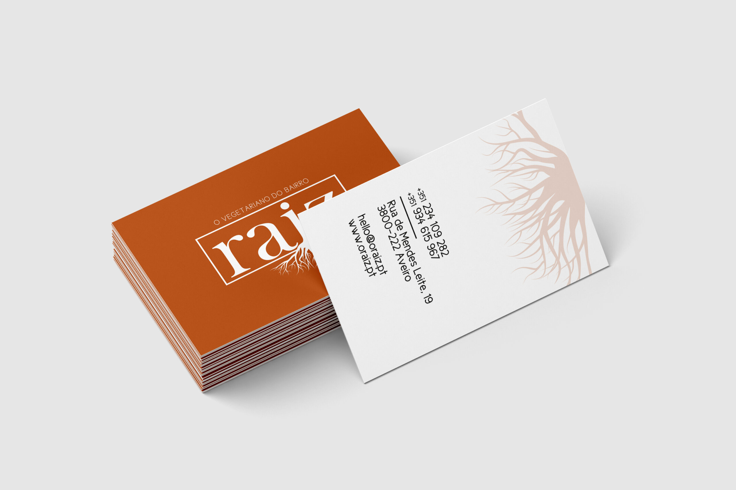
Raiz – O vegetariano do bairro
What people ask us before starting work in this field.
Tell us what you make, how you sell it and where you want to get to. You will get a proposal with scope, phases and price, from the brand to the packaging and the online shop.
Tell us when suits you and we will come back with a confirmation. It is not an automatic booking: a person always confirms the meeting.